Tuesday, July 21, 2009

Beauty Shoot with Polina and Kat


Back in March I started conceptualizing a beauty shoot for my good friend Kat Sterrett. She is a make-up artist who donates a generous amount of time to Polina’s and my shoots and in return we stage beauty shoots for her that allow her to dictate the make-up and show off her range. For this shoot the concept was “landscapes.” The models have very different looks and complexions and I wanted to emphasize this with very different color and textural stories.
Three days before the shoot, we lost our hair stylist. Not wanting to scrap the shoot since coordinating schedules is the hardest part of any shoot, I quickly came up with an idea that allowed us to cope with the loss. I located 4 different helmets and styled the looks using old clothes from my attic and my roller derby gear. Kat’s approach to the make-up was to highlight single elements on the face in a way that complimented the styling. On set we loosely referred to the looks as Tank Girl, Easy Rider, Speed Racer and James Bond. These names and a quick glance in the mirror was all the direction we gave the models; the rest was up to them. There was never more than one model on set at a time so no model witnessed the other being photographed. I was fascinated to see how each girl chose to embody their character and work (or not work) with their huge accessory.
Kudos to Polina for agreeing to work with my crazy idea and for agreeing to shoot through the clear visor on our Bond chick. It wouldn’t have been the same had we kept it flipped up! And thank you to our lovely and tolerant models Kiley, Jenna and Yana.


These images and a few adddional detail images can be seen at
www.LEVELinterior.com under the ART DIRECTION tab.

Sunday, June 7, 2009

The Keller Kitchen Renovation

Kitchen renovations are never fun. They are messy, slow and disruptive in ways you can’t imagine until the day you come home and see your sink sitting in the dumpster. But when designed and executed well, it is one of the most rewarding improvements you will ever do to your home. Last winter homeowners Jim and Wendy Keller decided it was time to renovate their kitchen. They were already working with cabinet desiger Don Kluge of All Seasons Woodworks when I was brought into the project. The general layout had already been established but what they needed was the wow factor that, in my humble opinion, makes hiring a designer worth every penny. When the renovation was completed, the space, though not physically bigger, appeared to double in size and functionality.
I wanted to use this project to showcase some of the spacial issues and solutions that a designer may focus on as much as the homeowner will focus on the location of the refrigerator. Well, that and Polina’s photos are so stunning that I felt they deserved to be showcased in the zine as well as the portfolio.


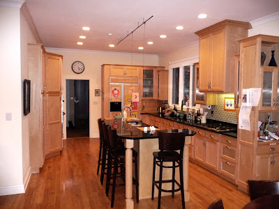
This is the Keller kitchen as it once was. While a perfectly fine kitchen, the cabinets and floor are too close in color creating a four-sided visual enclosure to an already petite room. With a new finish palette, we want to push the walls out by anchoring the floor and lightening the vertical surfaces. The current lighting plan is only lighting the floor and counter and not the ceiling thus creating a dark plane pushing down on the space. Tracing this dark ceiling with puny crown molding is giving the ceiling more visual weight than it deserves. The accent lighting is too close in color to the cabinetry to be of any interest and too small for such a large void between the counter and the ceiling. The island has a built in eating surface as well as a recessed working surface. This effect cuts the island in half and creates an attention-drawing disruption. This wouldn’t be bad if the counters of the island were worthy of being the focal point of the kitchen but they draw your eye to the messiest part of any kitchen; the sink. Wendy selected a great backsplash tile. It is trying to make this contemporary kitchen less contemporary but the injection of color is drawing attention to the wall cabinet that seems to have been full of helium when it was installed. OK. So here is what we did:


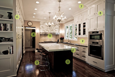
1. We designed a new island worthy of a second glance. The edge profile of this 40”x100” Calcutta Gold marble island top has been beefed-up to a chunky 2 ½” to avoid appearing visually flimsy.
2. Islands are special and deserve their own identity so we designed a base that stands out from the kitchen cabinets both in styling and color.
3. Barstools and counter stools are always on the go so make sure they are prepared to travel across your new floor. These McGuire stools have a firmly attached, clear plastic foot that can be dragged without scuffing. When stool meets floor the harder material will always win. Wendy gets a gold star for selecting a stool with a base wider than the seat. This means it will be less likely to tip when her little ones scale the sides. Not to mention that scooped walnut seat is stunning!
4. A room has layers: a foreground, a middle ground and a background. The previous design focused only on the foreground and neglected the way the three zones layer against one another. This back elevation has created a frame for the range but also a frame for the chandeliers. Lighting this wall pulls the eye, helping elongate the space. Remember, dark objects proceed, light objects recede.
5. I tend to refer to the range as the “captain’s chair” of the kitchen. Asymmetry and symmetry can be effective tools when punctuating a design element. While there is nothing symmetrical in this design, we opted to force symmetry at the range to make it distinct from the rest of the kitchen. To push it’s identity even further, we made the adjacent drawer-faces from stainless steel and exaggerated the length of the hood emphasizing the span of the work zone.
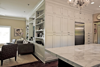
6. The sides of cabinets are often ignored in a design. This is because we tend to design in plan or elevation instead of three dimensionally. Letting the millwork wrap around the corner and turn into bookcases eases the transition from kitchen to living room as well as eliminating the need to design a pleasant end panel.
7. The ceiling is the supporting cast of any room and has a great influence over everything below it. Originally, I suggested painting it a barely-blue color but the Kellers were not at all receptive and now that I see the effect the chandeliers have on the ceiling, I’m glad we didn’t. The ceiling is only illuminated in the middle, allowing the edges to appear darker than the trim. I wanted to tint the ceiling color to make the crown appear bright and showcase its nuances. As a general rule, consider your ceiling the 5th wall but when holding up a paint chip to see what it will look like, hold it over your head. On the ceiling it is always up to 2 full shades darker!
8. Respecting the lines can make or break a design. When choosing where to put the horizontal break in this side panel, we looked at the strongest line in the elevation; the one that continued across all of the cabinets. There is only one line that can be seen in the pantry, the uppers and the stove housing. This line originated from the door opening height. Controlling and relating horizontal lines is the tell tale mark of a designer.
9. A backsplash can really help or hurt a design. In this case, the back wall is a mess. The original window is low and the wall cabinet needed to be high enough to fit an appliance under it. Applying a distinct color or loud pattern would have emphasized the difference. Choosing to make a backsplash unique or bold should only happen if it is one of the three strongest elements in the space. In this design the island, the range and the window view get top billing. Bye-bye backsplash. Kudos to Wendy for this soft and lovely selection. You have the eye lady!

That’s 9 things that make this kitchen groovy. In two hours time, Polina knocked this one out of the park. Thank you for shooting it under the wire! What is the coolest thing in your kitchen? Do you have an awesome mixer? A unique material for a counter or backsplash? Do you use any unusual furniture in your space? Let’s talk kitchens for a sec.
Visit my website: levelinterior.com to see more pictures of this great little project! I also wanted to note that the original cabinets, counters and appliances found a new home after demolition.

Saturday, June 6, 2009

LEVEL in the press

A few weeks back I was copied on an email response to Konrad Marshall (Indy Star arts reporter) from Wil Marquez:

Marshall,
Come te sientes amigo! Many thanks for asking me, your homework can stop here. I will offer these 5 uniquely different, but special individuals. These 5 are to me the most intriguing individuals I know and whose dialog is fit for a conversation on design at any level. They all are doing interesting work at some level and can inform your article with guts and substance. Good luck! let me know if you need their information, they should be easy to find. They are in no particular order

1. Brian McCutheon - Artist/Fabricator
2. Nikki Sutton - Interior Design with LEVEL
3. Jason Barisano - Architect A2SO4
4. Ana de Brea - Professor of Architecture, Ball State University
5. Cory Robinson - Professor at Heron/ Furniture Designer


Three weeks later, this story launched in the Star.


Will, thank you for the kind words. I am not sure what I did to land on this list but I'll take it! And thank you Konrad for featuring my work along such dedicated artisans. To learn more about Wil check out this interview.

I wanted to post this story for a couple reasons. One, for blatant self promotion. Two, because Chris Foster of Fosterweld did not get credit for the fabrication of the coffee table. And three, because I mention in the article that the table's design was inspired by two pieces of furniture in the room, neither of which were pictured. So I snapped one with my trusty iphone.:


The hung storage pieces featured in this image are MASH Studios LAX Wall Mounted Shelf from Design Republic and the rocker is the Hubbard rocker from Room and Board.
This is an aerial view of the coffee table. The thin steel that forms the shelf and the top are painted with a white enamel. The top spills over on the right, hiding the table's contents from the open room. Steel was selected for both its durability and its weight.
The legs are were kept raw to showcase the irregular chatter marks made by Chris' grinding. We knew the legs of the Room and Board chair were natural steel but we were surprised when it arrived that it too had exposed grind marks. A happy little accident!

This project is a loft renovation that I did in Mill No. 9 and has just wrapped up in the last week. The owners, Rob and Carol Lukemeyer are two of the most dynamic people you could ever hope to befriend. Ms. Osherov and I will be shooting their space later in the month. Stay tuned! Thanks Rob and Carol for allowing the Star to photograph your space just one day after your vacation!

Monday, June 1, 2009

“The Target Aesthetic” at The Toby

My new favorite event in Indy happens nearly every Thursday night at The Randall L. and Marianne W. Tobias Theater, also known as The Toby, at the IMA. The newly renovated theatre has a great vibe with great acoustics, ample comfy auditorium seating with places to park your coffee or wine (yes, you can purchase beverages in the lobby) and there is a lovely accessible seating area furnished with easy to move Philippe Starck Ghost Chairs.

Photo snagged from the IMA website.


Under the direction of Anne Laker the theater has been chock-full of interesting film showings, digital art screenings and guest lectures. This Thursday Jeff Carter, senior designer for Target, will be discussing “the retail giant’s democratic design-for-all philosophy and collaborations with designers such as Michael Graves and Isaac Mizrahi.” In the U.S. the top two big box retailers are Wal-mart and Target. While Wal-mart has continually boasted low pricing, Target has always tried to balance celebrating product design with product affordability. It wasn’t until Target started to feature Michael Graves’ housewares that I really took notice of their design awareness. Fourteen years later you can enter just about any department in Target and see a “star” name. I never expected to read: Alexander McQueen for Target. I have high hopes that Thursday’s presentation will be a unique insight into a company that has single handedly brought design awareness to the suburbs. If you are not an IMA member yet, (and why not?!?) hurry and join so you can enjoy this and future presentations at half the price. “The Target Aesthetic” is June 4th at 7:00pm. Ticket prices are $7 Public / $4 Members / $5 Students. Get there a few minutes early to grab a drink and mingle in the lobby. Kudos to Anne for breathing life into this great venue!

These are some of the pieces designed by Alexander McQueen for Target. Yes please!


And this is why you should know this designer:
Alexander McQueen (British, b. 1969).
“Oyster Dress,” spring/summer 2003.
Ivory silk chiffon and silk organza.


See you Thursday!!!

Friday, May 15, 2009

Timeless Design-Is there still a need for it?

If I had known earlier that Objectified, the latest documentary by Helvetica director Gary Hustwit, was going to be screened at the The Toby in the IMA I would have put out an APB. This film explores the design and consumption of products from the designer’s point of view and I left the screening questioning how I as a designer and a consumer measure a product’s worth. Typically we judge the quality of a product by its longevity and performance; that we as consumers shop for products that we think will stand the test of time. However, after viewing Objectified, my appreciation for long-lasting products has been turned on its head.

When I attended the European Design Exhibit and Symposium at the IMA, some of the presenters were asked to discuss product sustainability and the price of ’designer’ goods in Europe. A typical direction that the responses traveled was toward the belief that in Europe things are designed to last forever and therefore need only be purchased once and kept forever. What I took away from the symposium is that if something is well designed it will be cherished forever, that my designs, materials, and spaces need to be just as desirable in 2009 as in 2029.

Now fast forward to last night and this guy (I know what you're thinking) says:

Karim Rashid. *Examples of his work can be seen at the bottom of this post.


“If the average shelf life of a high-tech object is less than eleven months, why on Earth does anything have to be built to be permanent? It should all be 100% disposable. You know, I think my laptop should be made of cardboard, or my mobile phone could be a piece of cardboard, or it could just be made out of something like sugarcane or bioplastic.”


In the Indianapolis Star I made comment that European design principals do not translate to us as consumers. In Indiana, I feel we buy based on trends and fashion. We swap out all of our kitchen appliances because the ones we have aren’t stainless. We buy a new TV because the one we have won’t mount on the wall. We buy new jeans because the pair we’re wearing have boring pockets. And when we shop to replace those things, price tends to influence our choices because we know this isn’t the last time we will be buying this item.


To bring this topic back to my field, it should be pointed out that people are opting to reside in their homes for relatively brief amounts of time. Decades ago people died in the same home in which they raised their children. Today, individuals can expect to live in an apartment, a starter home, their family home, and an empty nester home. Business sizes fluctuate and their space requirements change accordingly. A company can start in the basement of a house, then fill a downtown office complex, and then perhaps become a completely mobile organization. So why would a client buy solid cherry casework that will not only outlast their stay but outlast the trend that influenced me to design them? What happens to that casework when they move or remodel? Why are they looking for sturdy furniture that will last years?


So here I am, marinating all of the elements of product consumption; need, cost, appearance (form), function and longevity. While cost and appearance vary wildly (usually in tandem), need, function and longevity seem to always be elements of a product that can’t be compromised. But why? Why does my vacuum cleaner come with a 10-year warranty? Do I really expect to have it that long? Well, maybe, I rarely clean. Why is it that I have a closet full of beautiful well-made coats yet every fall I am seduced to buying another one?


Could consumers embrace the idea of temporary products? What if there was a clothing line that would eventually break down in water or could be added to a compost pile? Would you feel comfortable buying something if you knew it was intended to fall apart or degrade at a speed of fashion instead of tradition? You know you will have a new phone in a year or two. Why would you be hesitant to buy one that could dissolve?


So here I am trying to re-define my definition of quality in regard to product design as it relates to interior design. What is a quality product/design? Is it something that promises to last as long as you do or something that knows you well enough to know that your relationship won’t last that long?

* As promised, here are some of Karim Rashid's designs. Christian owns the Alessi watch and it is a gem!


Wednesday, April 22, 2009

Catou Couture in Trying Times

I have recently started taking resumes for an additional designer. While I am looking for someone with a few years of experience in the field of interior design, my mailbox continues to be bombarded with new graduates in search of a lucky break. I know that when I graduated in 2001, job openings felt limited. Now with gratuitous layoffs in the field of architecture and design, competition for jobs is even steeper. I told my good friend Polina Osherov that I wanted our next shoot to be based on the idea of an opportunity drought in our "The sky is the limit" world. As our plucky young model was transformed into distraught lonely model I thought to myself, I should probably be thinking of brighter, happier imagery but a girl can only shut out so much...


To see more of these images, visit my website. Thank you to our very cold model, Amy Hopper; our makeup artist, Beth Jerrels; clothing designer Bernie Martin of Catou Couture and of course Vladamir Osherov.

Sunday, March 29, 2009

Out of the alley and into the office

As I am working on ExactTarget’s current expansion, I am reminded of the laborious process that was “The Wall.” The wall was a project I spearheaded during their last renovation in the Spring of 2008 on the 4th floor of the Gibson Building at the corner of Michigan and Capitol. While presenting the look for the interior of the space to Axis I proposed commissioning some local artists to design and install a mural along a 115’ long corridor that separated the open office from the public spaces. I had just seen a great opening at Alias in Fountain Square the month before and found myself freshly hopped up on stencil art. I pulled out a couple of my Bansky and Fairey books and started explaining what I wanted to do. The thought was to make the corridor a stark transition between the highly illuminated, airy office that over looked the city skyline and the electric colored public spaces. In hopes of pushing this social transition in a visual way, I minimally lit the corridor, built a 10’ high wall that closed it off from any natural light and introduced a solid black carpet.
With the closing of Alias gallery (a real loss Indy!) I knew Holly and Dave Combs would be available to help me get this project off the ground. I have always been a fan of Dave’s stencil work, some of it hangs in my house, and I knew from some of their past shows and contacts that they were going to be able to deliver a pretty amazing product. The only thing I told the artists was that the wall had to be the coolest thing they have ever made. I wanted a layering of smaller projects, with some more polished looking than others. We were throwing around all these crazy ideas until I was thrown a wet blanket…
Soon after I was given the green light to get the project going I was informed that there was a hang-up with using spray-paint in the building. Uhhh, graffiti artists, no spray paint. This was going to be interesting. My un-composed, wall of mini murals quickly became a more refined statement piece when we knew it had to be installed with a bucket of paint and a brush. This also meant we needed someone talented with a brush and comfortable working on a huge canvas. The Combs invited Justin Cooper. I have followed his work for the past 7 years and I was very impressed that he was going to come save the day. And save he did!
The following are some progress images. While the mural is miles from what was intended, it is still an impressive install and provides ExactTarget a little street cred.
Early progression of concept sketches.

Michelle Pemberton and I come by to check on the progress and snap these photos. Holly is afraid I am going to change something... again.

The team: Justin, Dave & Holly

Dave Combs getting down and dirty.
Justin joked about having a crush on this particular subject.
Dave and Justin paint...

...while Holly models with the moon man.

Finished product photography by Polina Osherov.


To see more pictures from this project visit my website, they are listed under the INTERIOR DESIGN tab.

Friday, March 13, 2009

The Secret Museum and cute girls


Before the weekend gets underway, I wanted to alert everyone of a new collection of photos that I just added to the website under the Art Direction tab. A few weeks ago Polina and I did a photo shoot for Handbag Heaven, an online handbag store located in Greenwood. When I found out Kipp Normand was putting together a “Secret Museum” of salvaged goodies I knew it would be the perfect locations to shoot. Kudos to all involved. This may be my favorite shoot to date! And a special thanks to everyone at SEND for allowing us to turn their lobby into a full service salon for an entire afternoon!

Kipp prepares for the opening


Polina scouting


Monday, March 9, 2009

A little more Snow

In the post below, I mention working with Polina to shoot some publicity photos for Sara Snow. They turned out really great. Check out her blog for more!

Monday, January 26, 2009

Gold is the new green

Today Polina and I photographed Sara Snow. For those of you not familiar with the local celebrity, Sara is an aficionado in the ways of green living. She has hosted Get Fresh with Sara Snow on Discovery Health and Living Green with Sara Snow on CNN.com LIVE. She has most recently authored Sara Snow's Fresh Living; The Essential Room-by-Room Guide to a Greener, Healthier Family and Home. Today we were updating her portfolio of headshots. She came armed to the teeth with brightly colored separates and a stunning collection of jewelry. Each piece looked like it had a story. There was one particular piece I had to ask about:


The coloring wasn’t quite gold, brighter than bronze but duller than brass. It was really cool and vintage looking but the composition felt totally modern. Turns out it was made by this cool jewelry company, Alkemie. Their pieces are forged from reclaimed metals. They can be purchased from econsciousmarket . These are a couple of my favorites… hint, hint Christian.
When you are done buying a new necklace, check out Areaware.
What a great place to go for birthday gifts! This melted army man bowl is almost as hot as the retainer necklace which is almost as cute as the moustache mirror.


Friday, January 23, 2009

The best lookin' show on TV: Mad Men

OK, I am going to post one last late night tribute entry before turning in: I have been jonzin to see the second season of my new favorite television show, Madmen. I received season 1 on DVD for Christmas and had watched all 13 episodes by New Year. The stories and characters are great but the series' styling steals the show. I need to watch the episodes twice; once to watch the characters and again to take in the setting, costumes, hair and lighting:


What a fine looking period the 60's were. And for the record, I believe this was the best era of men's fashion ever. If you are slim, there is no excuse to not own a great two button, fitted suit. If Madmen doesn't convince you, pop in your copy of North By Northwest and Cary will school you on how great a well dressed man can look!
If you could replace your wardrobe with that of a television or movie character, who would you choose?

When a couple of icons get together

So, Polina and I got together for a quick cocktail last week to discuss concepts for a shoot we are doing on Wednesday when she flashed a photo from Louis Vuitton's current ad campaign featuring Madonna. After a little goggling I found this pretty little film.

Sunday, January 11, 2009

Happy Black & Blue Year!

On a completely non-design related topic, last night was the season opener for our local roller derby league, The Naptown Roller Girls.


The 2009 season will be the league’s third and will introduce a new junior varsity team, The Warning Belles. Last night our varsity team, The Tornado Sirens, bouted the Pittsburgh’s Steel City Derby Demons. Although the ticket count has not been made official, I am guessing there were somewhere around 3,000 spectators. Our league’s fan base never ceases to amaze me. The average attendance for our neighboring Midwest leagues is more like 300-500 spectators.
Last night was a tough loss for our Sirens. While they managed to dominate during the first half of the first period, Pittsburg eventually figured out the Siren’s strategy, adjusted their game play and swiftly put up a painful point spread. With a solid lead at the end of the first period, the Steel City girls just kept racking up points in a big way. It was obvious that Naptown was not going to win this one. However, when I looked around there was not a empty patch in the crowd. If I were at a Colts or Pacers game people would be filing out early to get a head start on the traffic.
I don’t know what spell our girls have cast on the city, but 3 years later they are just as enchanted. And rightfully so, roller derby is one exciting sport! Maybe it is the fact that these girls do everything for free; they run the business of the league, organize practices, schedule and compete in the bouts and even clean up the pavilion for no pay. In fact, roller girls pay to play! I have always been told that a person is likely to succeed if they are doing something they are truly passionate about. There is something intoxicating about a person with passion and these girls have it. With 5 minutes left in last night’s bout, you could see so much heart on that track. Maybe that is why the fans stay. As long as the girls are fighting, the crowd will have their back.
These images were taken at the bout by our amazing photographers Marc Lebryk and Tom Klubens:


As a retired roller girl I stay involved with the league as a member of the creative committee and a referee. I hope to share some of the behind the scenes work that goes into making this league so amazing but for now I just wanted to introduce you to your Naptown Roller Girls.

*This is for Polina: